Kingdom Supplements — Brand Revamp
Kingdom Supplements set out to redefine what a modern supplement brand could look like premium, performance driven, and clean. I was brought on to lead the full creative direction and design rollout, building a cohesive identity that would translate seamlessly across packaging and retail.
Approach
The goal was to balance power and purity creating a look that felt elevated yet approachable for athletes and everyday users alike. I developed the core brand system logo, typography, color palette, and visual language then extended it through packaging to ensure a consistent presence at every touchpoint.
Execution
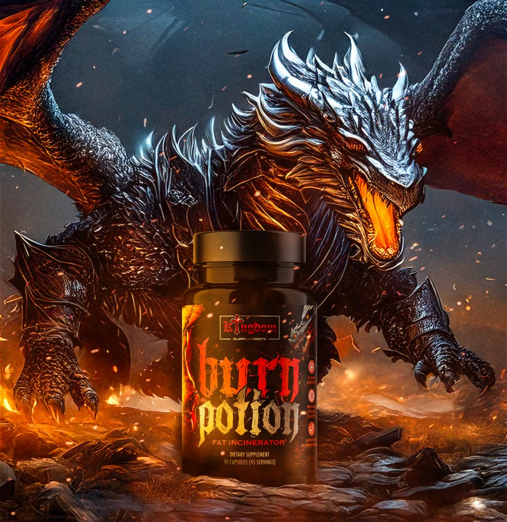
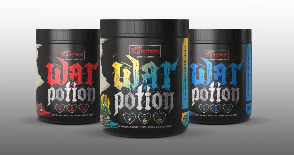
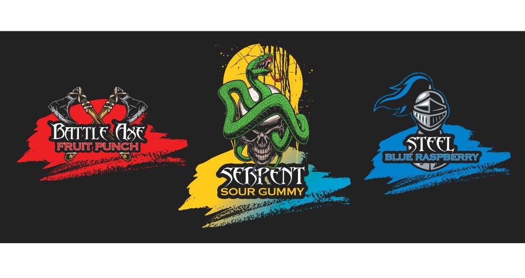
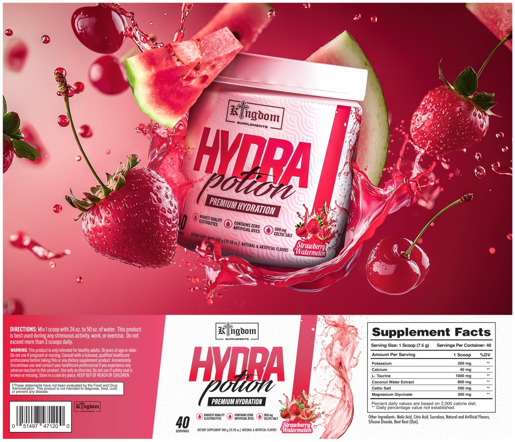
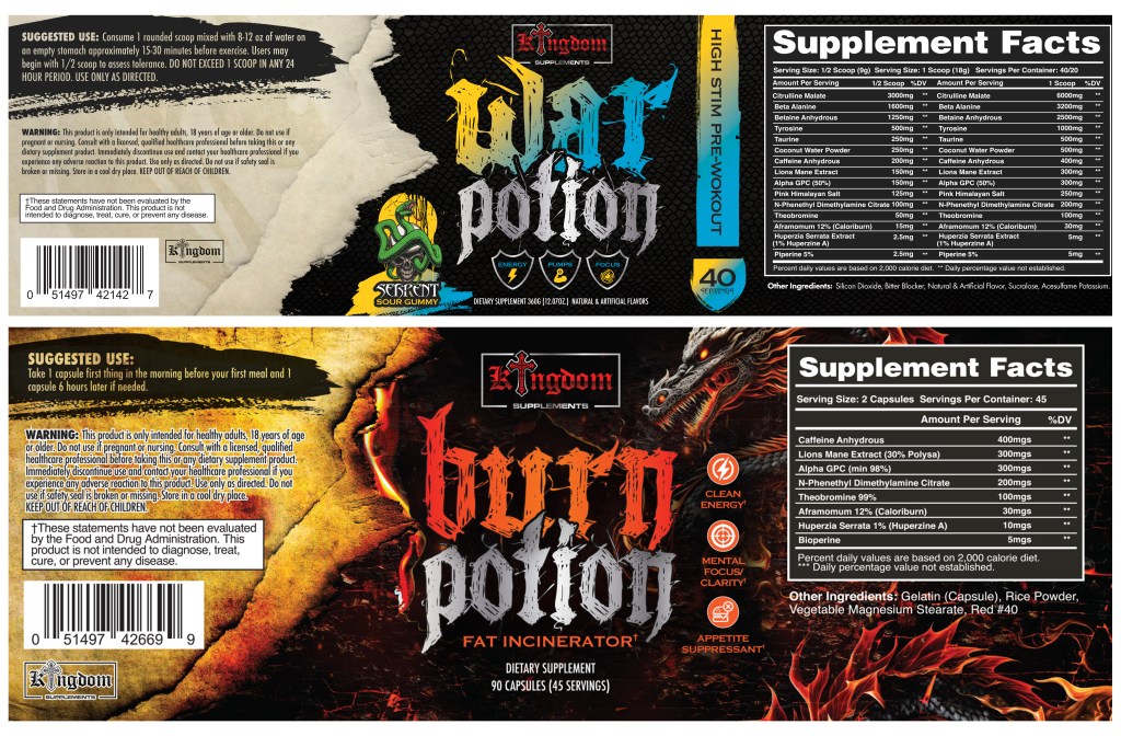
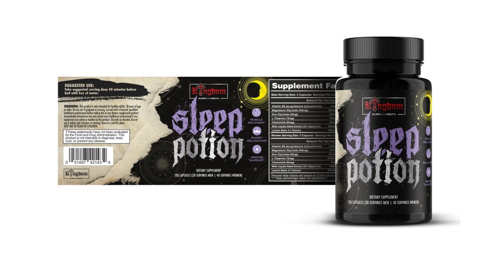
- Brand Identity: Designed a bold yet refined logo system and visual toolkit that reflect strength and precision.
- Packaging Design: Built a scalable packaging system for multiple product lines, focusing on shelf impact and clarity within strict supplement regulations.
- Digital & Social: Translated the brand into a dynamic digital experience with clean UI, product storytelling, and campaign assets optimized for engagement.
- Art Direction: Established the visual tone for photography and content, highlighting performance, purity, and authenticity.
Impact
The rebrand gave Kingdom Supplements a unified visual foundation that elevated its market presence and positioned it competitively among modern fitness and wellness brands. Every design choice from the label typography to the tone of voice online works together to project confidence, quality, and trust.
Role: Creative Direction, Brand Identity, Packaging, Digital Design, Art Direction